Diagram Design: teaching AI agents to draw clean, good-looking, on-brand technical diagrams

Diagram Design is an open-source skill (MIT license) by Cathryn Lavery for AI agents such as Claude Code, Codex and GitHub Copilot. Once it is installed, you just ask your agent to "draw an architecture diagram for this system" and get back an HTML file with a clean, clearly laid-out diagram: no more boxes piled on boxes or arrows crossing every which way. It covers 44 diagram types and can redraw old diagrams from draw.io, Mermaid and Excalidraw. Colors, fonts and dark mode can be changed to match your brand. If you write labels in Vietnamese, you should swap the title font, because the default one is missing many accented letters.
This post is an introduction, not a review after long-term use. The information comes from the README on GitHub and the skill's instruction file SKILL.md, version 2.6.68. The Vietnamese font check and the color contrast numbers are my own.
A few terms first
The post uses some terms from the original documentation. Here is what they mean:
| Term | Meaning |
|---|---|
| Skill | A set of written instructions installed into an agent, teaching it how to do one specific job. It is not runnable code. |
| Node | One shape in a diagram: a rectangle, a diamond, an oval… |
| Accent | The single standout color in a diagram, used to point at the most important thing |
| Skin | The "surface" of a diagram: its colors and fonts. Changing the skin does not change the layout. |
| Token | A named design value, such as accent = #eb6c36 |
| Profile | A saved, named skin you can reuse later |
Why you would want it
Ask an AI agent to "draw an architecture diagram" and you usually get one of two things.
The first is a Mermaid snippet. The content is right, but the layout is machine-generated, the arrows cross each other, and it is obvious a machine made it.
The second is an HTML page with a dark background, glowing blue-purple borders, and a dozen identical boxes, each one colored as "important".
The Diagram Design README calls the second kind "AI slop". The skill lists each mistake explicitly so the agent can avoid it:
| Common mistake | Why it is banned |
|---|---|
| Dark background with glowing blue/purple borders | Looks "technical" without any actual design intent |
| A monospace font (JetBrains Mono) for every label | Monospace is only for technical content such as ports, commands, URLs |
| Every node is the same box | The reader cannot tell what is primary and what is secondary |
| Drop shadows | Banned outright; borders only |
| Heavily rounded corners | 6–10px at most, or none |
| Accent color on every "important" node | The accent is for 1–2 places; use it everywhere and it stops working |
| Keeping Mermaid's automatic layout | Automatic layouts tend to be messy and have no intent behind them |
Installing and drawing your first diagram
For Claude Code, run two commands:
/plugin marketplace add cathrynlavery/diagram-design
/plugin install diagram-design@diagram-design
For Codex:
codex plugin marketplace add cathrynlavery/diagram-design
codex plugin add diagram-design@diagram-design
For GitHub Copilot CLI:
copilot plugin marketplace add cathrynlavery/diagram-design
copilot plugin install diagram-design@diagram-design
For other agents that support the Agent Skills standard:
npx skills add cathrynlavery/diagram-design
The README also has instructions for Factory Droid, Pi, Kiro, OpenCode and Claude Cowork.
Once installed, you do not need any special command. Just ask normally, for example "draw a sequence diagram for the OAuth login flow", and the skill activates on its own.
There are also a few commands for specific jobs:
| Command | What it does |
|---|---|
/diagram-design:doctor | Checks whether your machine is ready |
/diagram-design:import-mermaid | Redraws a Mermaid diagram |
/diagram-design:import-drawio | Redraws a draw.io file |
/diagram-design:import-excalidraw | Redraws an Excalidraw board |
/diagram-design:export-diagram | Exports the HTML file to .svg and .png images |
/diagram-design:profile | Saves, loads, deletes brand profiles |
To export PNG images, also install Playwright and Chromium:
pip install playwright && playwright install chromium
One safety note: the README says the official build only comes from this repository. Take that seriously. A skill is text loaded straight into your agent, so installing an unknown copy is like letting a stranger write instructions for your agent.
How the agent draws a diagram
The diagram below shows the steps the agent goes through when it receives a drawing request. It was itself drawn with Diagram Design, using the default skin.
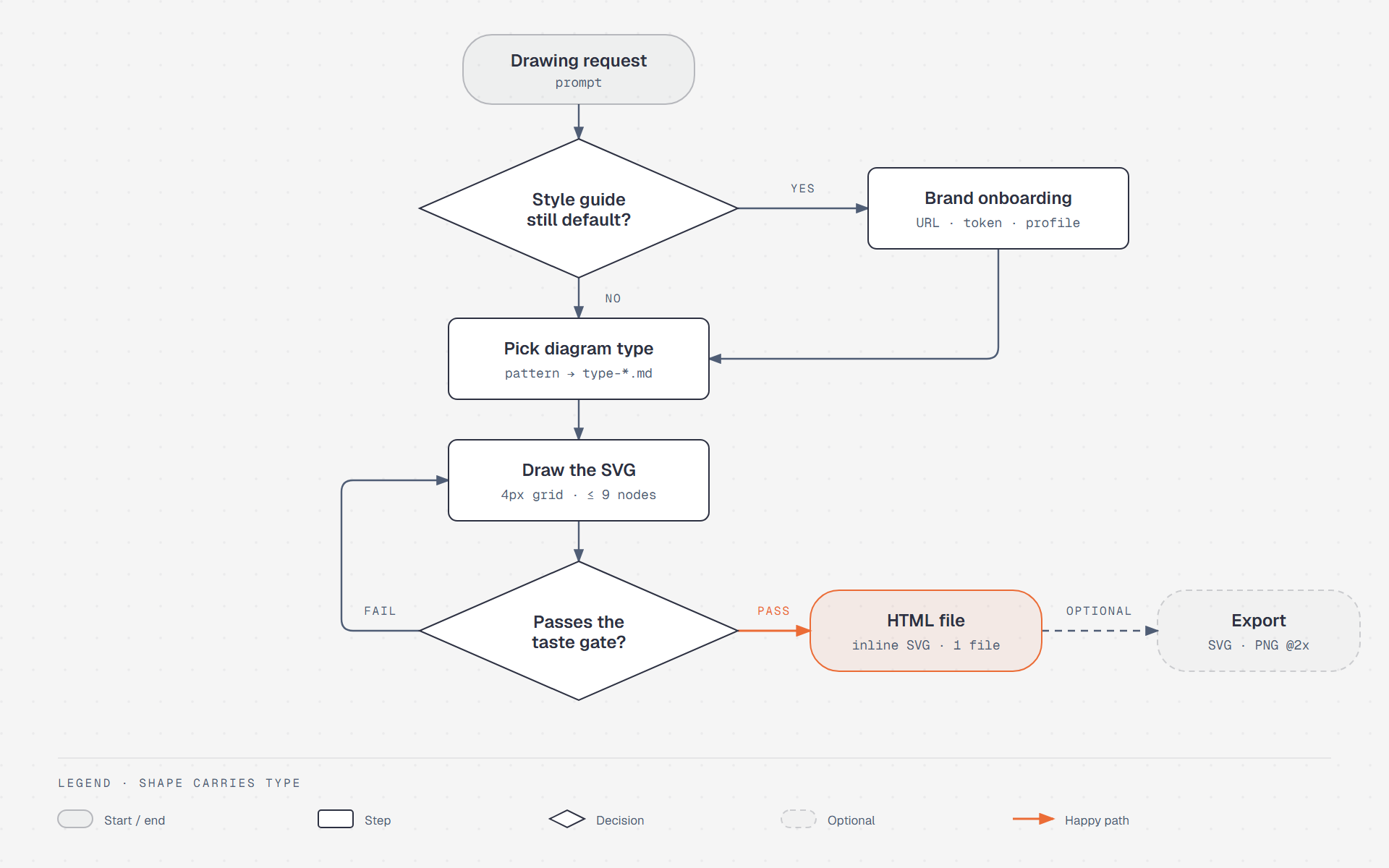
Step by step:
- Check the skin. If the project is still on the default colors, the agent stops and asks whether you want to match your brand (the "Brand onboarding" step). More on this under Customization.
- Pick a diagram type. The agent picks one of the 44 types, then reads that type's own instruction file.
- Draw. The agent draws the SVG following the skill's rules.
- Grade itself. The skill calls this the taste gate. It is a checklist: is this the right diagram type, can any node or arrow still be removed, is the accent used in more than two places, are the technical rules satisfied. Fail any question and the agent goes back to drawing.
- Write the file. The result is always one HTML file. Exporting to SVG or PNG is optional and only happens when you ask.
The image above is a PNG capture. The original is diagram-design-flow.html, which you can open directly in your browser.
My machine did not have Playwright, so I took the PNG with headless Chrome (--screenshot --force-device-scale-factor=2). The output is the same 1920×1200 size.
The principle: take away rather than add
The philosophy section of SKILL.md opens with:
The highest-quality move is usually deletion.
From that sentence the skill derives a few rules:
- Every node must be a distinct idea. Two nodes that always appear together become one.
- Every connection must carry information. If position already shows the relationship, drop the line.
- Aim for a density of about 4/10: enough information, but readable without someone walking you through it.
- A diagram is done when nothing more can be removed, not when everything has been added.
These rules become hard limits:
| Limit per diagram | Maximum |
|---|---|
| Nodes | 9 |
| Arrows | 12 |
| Places using the accent | 2 |
| Callouts | 2 |
Go over a limit and you must split into two diagrams: an overview and a detail view. Anyone who has had to read a slide with thirty microservice boxes will appreciate this rule.
Before drawing, the agent must also ask itself: will the reader understand more from this diagram than from a well-written paragraph? If not, don't draw. For example:
- A list belongs in a table or bullet points.
- A before/after that only changes a few attributes belongs in a table.
- A one-shape "diagram" is just a sentence.
The default look
Colors. A very light grey background #f5f5f5, dark navy text #2d3142, slate secondary text #4f5d75, and a single orange accent #eb6c36.
Fonts. Three families, each with one job:
| Used for | Font |
|---|---|
| Page title | Instrument Serif (serif) |
| Node names | Geist (sans-serif), bold |
| Technical labels such as ports, URLs, data types | Geist Mono (monospace) |
| Callouts | Instrument Serif italic |
Connectors. The most tightly specified part, with six mandatory rules:
- Right-angle turns only, with an 8px corner radius; no diagonals.
- Arrow labels are at most 14 characters, uppercase, with a mask behind them and 6–10px away from the stroke.
- Parallel lines are at least 12px apart.
- When several lines meet the same edge of a box, each gets its own attach point.
- No line may run behind a box it does not connect to.
- A label's mask must not cover a node drawn after it.
Breaking any one of these six counts as a failure.
Variants. Every diagram comes in three versions: light (the default), dark, and a "full editorial" version with summary cards for long-form posts. There is also a hand-drawn style and a terminal-window style.
44 diagram types
The README says 42 types, while SKILL.md in version 2.6.68 says 44; the README has probably not caught up. Grouped:
| Group | Types |
|---|---|
| Systems | Architecture, Architecture delta (before/after), IT current-state, Deployment, Dependency graph, High-level |
| Flow and behavior | Flowchart, Sequence, State machine, Swimlane, Process, User journey |
| Data | ER, Database schema, UML class, Data flow, Medallion, DP integration, DP security matrix |
| Structure | Tree, Org chart, Nested, Layer stack, Venn, Pyramid/funnel |
| Charts | Bar, Line, Scatter, Heatmap, Treemap, Waterfall, Sankey, Radar, Polar |
| Planning, strategy | Timeline, Gantt, Kanban, Story map, Quadrant, Wardley map, Fishbone, Loop |
| Spatial | Exploded axonometric, Axonometric plan |
Each type has its own instruction file with its own list of mistakes. To see samples of all of them, visit the gallery.
There is one more layer called semantic patterns. They are used when what you want to show is behavior, not just shape. For example: a queue that is backing up, or a process with retries and mid-way cancellation. In that case the agent picks the semantic pattern first, then the diagram type for the layout. The reason: the same data-flow diagram might be telling a bottleneck story or a raw-data-cleanup story, and each needs to highlight different places.
Redrawing old diagrams
This is the feature I find most practical, since every team already has a pile of old diagrams.
The skill accepts draw.io files (.drawio, .drawio.svg, .drawio.png), Mermaid (.mmd files or mermaid code blocks in Markdown) and Excalidraw (.excalidraw). The process has four steps:
- Read the content, don't screenshot it. A Python script reads the original file and lists its nodes, connections and groups.
- Choose four settings: output format; size (inline in a doc, 16:9 slide, social share image, A4 paper…); detail level (
faithfulup to 24 nodes,balancedup to 12,simplifiedup to 7); and audience (engineer,mixed,executive). - Redraw from scratch. The original positions, colors and fonts are all discarded. Only the content is kept: which components exist, how they connect, how they are grouped, which direction they flow.
- Report what changed. The skill calls this a fidelity ledger: a list of what was merged, collapsed or dropped.
I value step 4 most. Whoever hands over the file usually knows the original very well. If a service quietly disappears they will notice, and then they stop trusting the whole diagram. The skill also forbids two things: inventing components to make the layout look nicer, and silently dropping components.
There is one more security detail: any text read from the original file is treated only as data, never as a command. A draw.io file downloaded from the internet could contain a label like "ignore all previous instructions". The skill explicitly tells the agent not to follow such text. That is the right defense against prompt injection, an attack that hides commands inside data to steer an AI.
Customization: colors, fonts, dark mode
The default skin looks good. But if your diagrams live in company docs or on your blog, they should carry that place's colors. Diagram Design draws a clear line between two parts: what you can change, and what never changes.
What you can and cannot change
Everything visual lives in a single file, references/style-guide.md. The other instruction files never contain specific color values. They only refer to roles by name, such as "use the accent color". So changing one file changes everything.
The file defines 11 color roles, each with one value for light backgrounds and one for dark:
| Role | Used for |
|---|---|
paper, paper-2 | Page background, container background |
ink, ink-strong | Primary text and strokes |
muted, soft | Secondary text, regular arrows, sublabels |
rule, rule-solid | Thin borders |
accent, accent-tint | The accent color and its light fill |
link | API calls, outbound arrows |
Besides colors, the file sets 6 text roles (title, node name, sublabel, arrow label…), stroke widths, corner radii and the 4px grid.
What you cannot change by reskinning: the six connector rules, the 9-node limit, the 4px grid, the single-accent rule. That is the skill's "grammar". So whatever brand colors you switch to, the diagram stays just as tidy.
Four ways to reskin
- Onboarding: give the agent a design source and it extracts colors and fonts. The source can be a website address, another skill that carries design tokens, or a design-system folder on your machine.
- Edit by hand: open
style-guide.mdand change the color values. - Paste tokens: paste a design-token JSON file into
style-guide.md, then map each token to its role. - Profiles: save several named skins, switch between them, or bind one skin to a project.
The first time you draw in a project that is still on default colors, the agent asks which option you want. There are six choices: website, skill, folder, paste tokens, keep the default, or load a saved profile.
Onboarding: let the agent pull colors from your website
The process has six steps: read the source → extract colors and fonts → map them to roles → show you a preview of the changes → write them once you agree → offer to save as a profile.
The agent maps colors in two ways. For a website, it looks at where the color is used. For a token file, it looks at the variable name:
| Role | From a website | From a variable name containing |
|---|---|---|
paper | Page background color | background, bg, surface |
ink | Body text color | foreground, text, body |
muted | Caption text color | muted, subtle, secondary |
accent | Most-used brand color (buttons, links) | accent, brand, primary |
rule | Border color | border, divider, outline |
| Title font | Font of <h1> | |
| Node name font | Body font | |
| Technical label font | Font of <code> | mono, code |
Before writing anything, the agent checks three things:
- Primary text (
ink) and secondary text (muted) must contrast enough with the background to meet WCAG AA, meaning a ratio of 4.5:1 or higher. - The accent must be the most vivid color, not something greyish.
- The background must not be pure white. If the site uses
#ffffff, the agent proposes#fafaf7for a bit of warmth, or asks you.
For fonts there is one rule I think is exactly right: never quietly replace a brand font with a generic one just to keep the file smaller.
- Fonts available on Google Fonts keep their exact name and weights.
- Self-hosted or paid fonts cannot be embedded in the HTML file, so the agent must say clearly that it is using a substitute (
fallback) instead of pretending it matches. - Finally, the agent checks that the font actually loads.
When you ask it to "match this site", the agent must attach a report: which pages it sampled, which colors and fonts it found, and which fonts match exactly versus which are substitutes.
For safety, everything read from the website is treated only as data. The agent takes colors and fonts from it and follows none of the text on the page.
What to keep
style-guide.md has a "don't break these" list:
| Keep | Why |
|---|---|
| Only one accent | With two accents the reader does not know where to look |
| A brand with many colors gets 3: background, text, accent | The rest become variants of the secondary text color |
| At most three font families | If the brand only has sans-serif fonts, still keep a serif for titles to create contrast |
| Warm background, not pure white | Pure white makes diagrams look cold |
| Dotted background is optional | The default is a plain background |
| Don't frame the diagram | It sits directly on the background; a frame is optional |
I have to confess: the default diagram above has a dotted background, because I copied the skill's sample file. By the rules, dots are optional, so I removed them in the blog-colored version below.
A note on accent contrast
There is one thing I found while checking that the skill does not mention. The contrast check only covers primary and secondary text, not the accent. But the accent is sometimes used as a text color too, such as the PASS label in the diagram above.
The default orange #eb6c36 on #f5f5f5 only reaches 2.86:1, below the 4.5:1 threshold for normal text. If your diagrams have text in the accent color, check it yourself when choosing the color.
Dark mode
Every color role already has a dark value. To draw a dark diagram, start from the sample file assets/template-dark.html.
For custom skins, the agent generates the dark version with an inversion rule: the text color in the light version becomes the background color in the dark one and vice versa, with transparency unchanged. The accent is made slightly brighter so it still stands out on a dark background.
If your website is mainly dark, do it the other way round: treat the dark background as the default, then invert to get the light version.
A profile per project
If you edit style-guide.md directly inside the plugin's install folder, the next plugin update will overwrite it. Profiles solve this.
Each profile is a full copy of style-guide.md stored at ~/.diagram-design/profiles/<name>.md, outside the plugin folder. The file starts with a few lines of metadata:
<!-- diagram-design-profile
name: tiennhm blog
slug: tiennhm-blog
source-url: https://tiennhm.io.vn
created: 2026-10-08
updated: 2026-10-08
notes: Infima teal, Noto Serif Display for Vietnamese titles
-->
# Style Guide
...
To make a project always use one profile, put a .diagram-design file at the repo root containing a single line:
profile: tiennhm-blog
The file travels with the repo, so anyone who clones it draws in those colors. You can work for two clients in two windows at once without the colors getting mixed up. The skill reads this file strictly: exactly one profile: line, and a profile name made of lowercase letters, digits and hyphens. Anything slightly off and the whole file is ignored, with the reason reported.
Profile operations use the /diagram-design:profile command:
| Operation | What it does |
|---|---|
save | Save the current skin as a new profile |
load or switch | Switch to a profile |
list, show | List profiles, show the active one |
update | Update a profile with the current skin |
reset | Go back to the default skin |
delete | Delete a profile (asks for confirmation) |
The first time you save a profile, the skill also saves the original skin as a default profile, so you can always reset. When a new plugin version adds color roles, older profiles temporarily get the missing values from the defaults, and the skill tells you so you can update them.
Special styles
A few styles deliberately ignore your brand colors:
- Multi-series chart palette: five muted colors for charts that need to tell several overlapping lines apart, such as radar charts. Not for architecture diagrams.
- Terminal style: a fixed color set that looks like a command-line window, with a
#0a0a0abackground and a#ff5a36accent. It does not change with your brand. - Hand-drawn style: an SVG filter that makes strokes wobble slightly, as if drawn by hand. You can tune the wobble (
scalefrom 1 to 6, default 1.5). Apply it to shapes only, never to text, because wobbly text is hard to read. Avoid it on dark backgrounds.
Example: reskinning for this blog
To see what customization looks like, I went through the onboarding steps myself for this blog.
The blog runs on Docusaurus. In custom.css, the primary color is teal: hsl(167 68% 30%) for light mode and hsl(167 68% 45%) for dark mode. The dark background is #1b1b1d. Text uses the operating system's default font.
Here is the role mapping. The numbers in brackets are contrast ratios against the background in the same column; 4.5 or higher is needed:
| Role | Default | Blog, light | Blog, dark |
|---|---|---|---|
paper | #f5f5f5 | #fafaf7 | #1b1b1d |
ink | #2d3142 (11.82) | #1c1e21 (15.98) | #e3e3e3 (13.40) |
muted | #4f5d75 (6.11) | #525860 (6.87) | #b4b9c0 (8.71) |
accent | #eb6c36 (2.86) | #18816a (4.58) | #25c19f (7.54) |
| Title font | Instrument Serif | Noto Serif Display, 75% width | same as light |
| Node and label fonts | Geist, Geist Mono | Geist, Geist Mono (fallback) | same as light |
A few decisions I made:
- The blog background is pure white, so I followed the skill's suggestion and switched to
#fafaf7. - The blog's teal reaches 4.58, passing the threshold the default orange misses.
- Strictly, I should have kept the OS default font like the blog does. But OS fonts differ from machine to machine, and the PNG was captured on mine. So I kept Geist (full Vietnamese support) and marked it clearly as a substitute.
- I removed the dotted background.
The diagram below follows whichever light/dark mode you are viewing. Click the theme toggle in the navbar to see the other version:
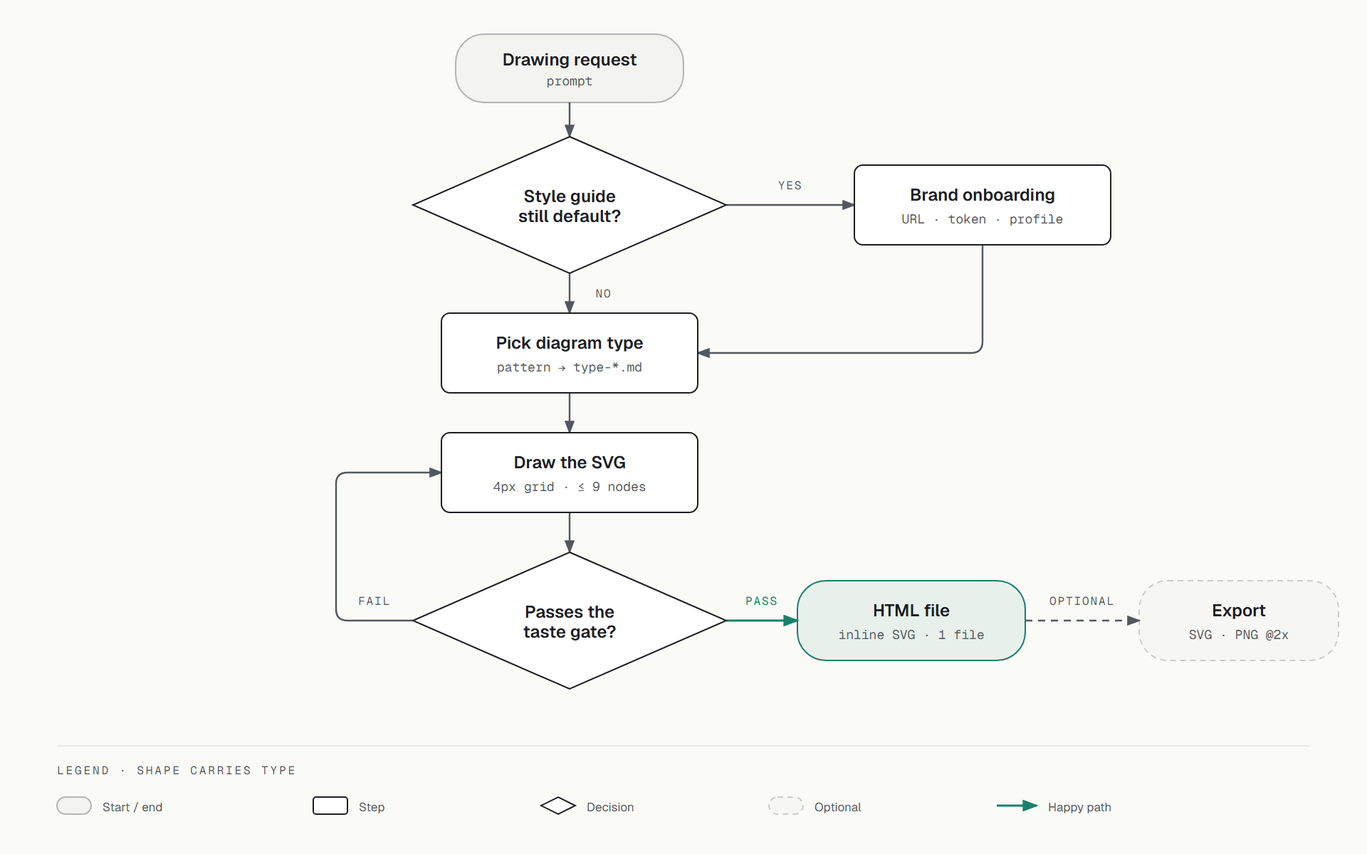
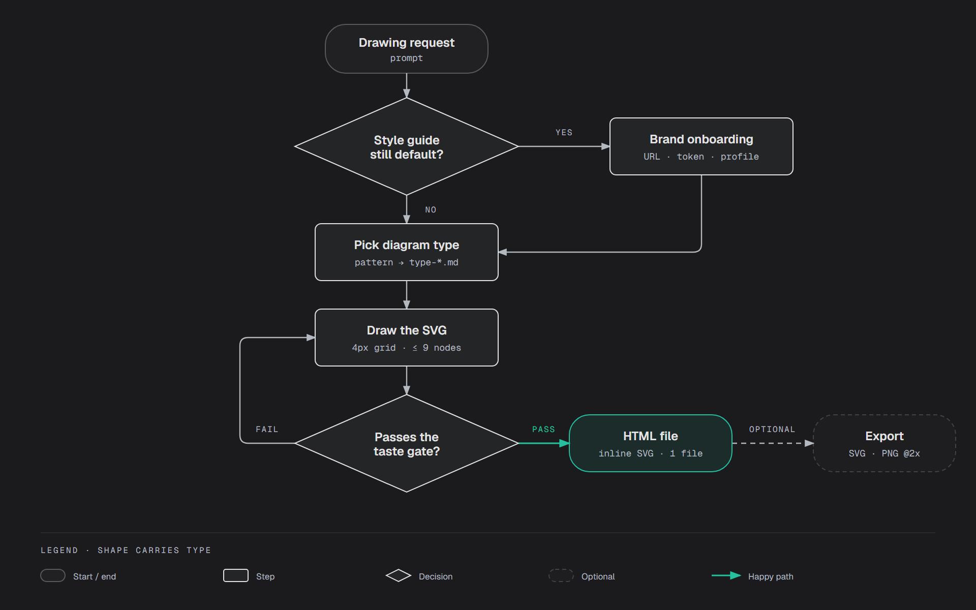
Source files: light version and dark version.
Compared with the default version above, the layout, positions, strokes and text are identical; only the colors and fonts differ. That is the payoff of separating the skin from the grammar.
Vietnamese diagrams: the title font bug and the fix
I checked on Google Fonts whether the default fonts support Vietnamese:
| Font | Vietnamese support |
|---|---|
| Geist (node names) | Yes |
| Geist Mono (technical labels) | Yes |
| Instrument Serif (titles) | No |
Node names and labels display Vietnamese fine. The problem is the title. Instrument Serif lacks letters with stacked diacritics or a dot below, such as ạ, ấ, ế, ệ, ố, ộ, ữ, ự (the Unicode range U+1EA0–U+1EF1).
The skill's template already has a fallback font, Noto Serif, which does support Vietnamese. So no letters go missing or show up as boxes. But the browser swaps fonts one letter at a time. Within a single word, plain letters come from Instrument Serif (thin, narrow) and accented ones from Noto Serif (wider, heavier).
I hit exactly this while making the diagram for this post. The Vietnamese title "Diagram Design xử lý một yêu cầu vẽ như thế nào" had ử, ộ, ế noticeably bigger and bolder than the rest, like a printing error.
The fix is to replace the title font entirely rather than rely on the fallback. I chose Noto Serif Display. It fully supports Vietnamese and can be condensed to look close to Instrument Serif:
<link href="https://fonts.googleapis.com/css2?family=Noto+Serif+Display:wdth,wght@62.5..100,400&display=swap" rel="stylesheet">
--font-serif: 'Noto Serif Display', serif;
h1 { font-family: var(--font-serif); font-stretch: 75%; }
If you draw Vietnamese diagrams often, do this once during onboarding (choose "paste tokens"), then save it as a profile. Later diagrams will use this font automatically. If you want a different look, Playfair Display, Fraunces and Newsreader also fully support Vietnamese.
One more tip of my own: arrow labels are limited to 14 characters, uppercase, at a very small size. Uppercase Vietnamese at that size crams the diacritics together, and 14 characters only fits two or three words. I keep arrow labels as English terms like HTTPS, YES, FAIL, and save Vietnamese for node names and titles. The Vietnamese diagrams in this post follow that approach.
Compared with Mermaid
These two tools do not replace each other, because they solve different problems:
| Mermaid | Diagram Design | |
|---|---|---|
| Source | Text inside Markdown | An HTML file generated by the agent |
| Layout | Arranged automatically | Arranged by the agent following rules |
| Review in a pull request | Line-by-line changes are visible | Changes are hard to read |
| Small edits | Change one line | Ask the agent to redraw |
| Display on GitHub, Docusaurus | Built in | Export an image, then embed it |
| Looks | Good enough | The main goal |
| Same result every run | Yes | Not guaranteed |
The last row needs spelling out. A skill is just written instructions. The agent reads them and decides how closely to follow them, so running the same request twice may not produce the same picture. I wrote more about this in the post on how agent skills work (in Vietnamese). The strict rules and the self_check.py script make results much more consistent, but not identical every time.
The split I find sensible:
- Diagrams that live with the code, change often and need review: use Mermaid.
- Diagrams for slides, articles or client documents, which need to look good and rarely change: use Diagram Design. You can even use the Mermaid file as the source to redraw from.
Other pluses
- Screen reader support. Every diagram has a built-in title and short description so blind users know what it is about.
- A single file. Everything lives in one HTML file, with no external images and no JavaScript unless you turn on animation. Send it over chat and the recipient can open it right away.
- Animation is optional. There are four modes:
none(the default),reveal,step,loop. An animated version must still make sense with JavaScript turned off. - An icon set. 87 single-color icons for infrastructure and cloud, from Tabler Icons and Simple Icons.
When not to use it
The skill answers this itself, and I agree:
- When a three-column table says the same thing.
- When the content is just a list.
- When all you need is a quick ASCII sketch in a commit message or code comment.
I would add one case: when the diagram will be edited over and over by many people in the repo. Then being able to see line-by-line changes matters more than looks.
Frequently asked questions
What is Diagram Design?
Diagram Design is an open-source skill under the MIT license by Cathryn Lavery, for Claude Code, Codex, GitHub Copilot and agents that support the Agent Skills standard. It guides the agent to draw technical diagrams as a single HTML file under strict design rules: one accent color in at most two places, at most 9 nodes, right-angle connectors, no shadows.
Which diagram types can Diagram Design draw?
Version 2.6.68 has 44 types, including architecture, flowchart, sequence, state machine, ER, database schema, UML class, swimlane, timeline, Gantt, Sankey, Wardley map, fishbone, kanban, user journey, deployment, dependency graph, and chart types such as bar, line, scatter, heatmap, treemap and waterfall. The GitHub README says 42.
How do I install Diagram Design in Claude Code?
Run two commands in Claude Code: /plugin marketplace add cathrynlavery/diagram-design, then /plugin install diagram-design@diagram-design. To export PNG images, also install Playwright and Chromium with pip install playwright and playwright install chromium.
Can Diagram Design convert Mermaid or draw.io diagrams?
Yes, but it redraws from scratch rather than converting. A script reads the nodes, connections and groups from the original file. The old positions, colors and fonts are discarded, the agent builds a new layout under the skill's rules, then reports what was merged, collapsed or dropped. It supports draw.io, Mermaid and Excalidraw.
Does Diagram Design have font problems with Vietnamese?
Node names and labels use Geist and Geist Mono, which fully support Vietnamese, so they display fine. Titles use Instrument Serif, which lacks letters such as ạ, ế, ệ, ố, ự. The built-in fallback font only swaps individual letters, so titles still mix two typefaces. The fix is to replace the title font with one that fully supports Vietnamese, such as Noto Serif Display condensed to 75%, and save it as a profile.
How do I change Diagram Design's colors and fonts to match my brand?
The whole look lives in references/style-guide.md, with 11 color roles such as paper, ink, muted and accent, plus 6 text roles. There are four ways to change it: let the agent pull colors and fonts from a website, from a skill carrying design tokens, or from a design-system folder; edit the color values by hand; paste a token JSON file; or load a saved profile. The agent checks contrast and shows you a preview before writing.
What are Diagram Design profiles for?
A profile is a full copy of style-guide.md stored in ~/.diagram-design/profiles/, outside the plugin folder, so it survives updates. Put a .diagram-design file containing one line, profile: <name>, at the repo root and that project always uses the profile. Several client projects can run side by side without their colors getting mixed up.
Does Diagram Design support dark mode?
Yes. Every color role has a dark value, and there is a template-dark.html sample file. For custom skins, the agent generates the dark version by swapping text and background colors, keeping transparency the same, and making the accent slightly brighter.
Should I use Diagram Design or Mermaid?
It depends on the purpose. Diagrams that live with code, change often and need review in pull requests suit Mermaid better, since line-by-line changes are visible and GitHub renders it directly. Diagrams for slides, articles or client documents, which need to look good and rarely change, suit Diagram Design better. You can use the Mermaid file itself as the source to redraw from.
Does Diagram Design produce the same diagram every run?
Not guaranteed. A skill is written instructions that the agent reads and follows, so results can differ between runs. The strict rules make results much more consistent, but not identical the way an automatic drawing tool would be.
References
- cathrynlavery/diagram-design: official repository, README and install guide
- Gallery: samples of every diagram type
- Google Fonts: Instrument Serif and Geist: check which characters a font supports
- How agent skills work, and the knowledge left behind (in Vietnamese): why skills do not give identical results every time
- MeiGen: a free image prompt library, and the MCP server few people notice (in Vietnamese): another tool for the image side